How to Zing up your Scrapbook Page.
- Sharni Haines

- Feb 18, 2023
- 6 min read
Hello lovelies,
need some inspiration and ideas how to make your Scrapbook pages come alive a little more? Want to make the photos 'pop' and make the background paper and colours work with your photo, not against it? Need a way to add more than one photo to page without it looking very average?


I may just have some ideas to help you...or get you started anyway.
As you can see above, the before & after pages. There is certainly more going on in the second page, but the colours work better together, they pick up the greens & yellows of the photos and almost become part of the whole scene instead of just looking like I have stuck some photos over the top of some designer paper.

I started this page with a sheet of DSP from Enjoy the Journey (Jan- April Mini Catalogue). The purple mountains are a lovely colour but not right for my photos, so I tore the paper in half and just use the bottom part.

ENJOY THE JOURNEY 12" X 12" (30.5 X 30.5 CM) DESIGNER SERIES PAPER
I stamped the pine trees from the Greatest Journey with Garden Green randomly over a sheet of Basic White 12 x 12"Cardstock. I also shaded Garden Green over the edges of the Basic White as well as a bit over the DSP mountain scene to make the colour match the photos a bit more. (see photos below taken from my Instagram reel).


I also stamped some script from the Ranunculus Romance Stamp Set in a brown StazOn ink (as I also stamped this script onto the photos later).
once I was happy with background, I adhered the two papers together.

Here you can see the script image & dots (from Quiet Meadow) that I stamped onto the page a little over the photo.

You may be able to see the distressed edges of the DSP at the bottom of the page. I used a Bone Folder and my fingers to tear it a little so it shows the stamping and inking I did on the Basic White Cardstock underneath. You may also notice I printed (not hand wrote!) the journaling, but ripped the bottom part of the cardstock to create a different texture and so it doesn't look so boxy and perfect.
The running die cuts are from the Greatest Journey Dies - cut from Crumb Cake & blended with Crumb Cake Ink.

I matted the two thin photos with a strip of Basic White 2-1/4" wide and cut the photos at 2" wide then placed them right up to the main large photo.

I chose to use foliage (Nature's Prints & Dies) embellishments because of the nature scenes in these Italian Mountains, also because they pretty much work with most photos...a little like using neutral colours.
The bee is from Honeybee Home & coloured with Water Colour Pencils.

So that my friends, is how I made my page work and bring out the photos perhaps a little better than the before photo. This page is my second page about our (hubby & me) trip to Italy with our son Angus. You can read a bit about it on my previous blog HERE.

This is the first page.
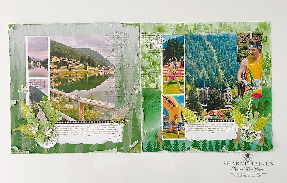
These pages show some of the beautiful scenes we experienced in a special part in the northern mountains of Italy, Madonna di Campiglio in Trento.
We spent a month (July 2022) traveling through Europe with our son Angus who was representing Australia in the Orienteering Team for 2022. He competed in many different countries as part of the Australian team and other times as an independent competitor.
It was exciting and a pleasure to be able to be with him during his tour. We are so proud of him and know he already has more oversea plans lined up for this year.
I look forward to creating more pages of our adventures with Angus in Europe 2022, and already have more of the same DSP collection from Enjoy the Journey lined up to match photos.
Thank you for visiting me, I have made a list of tips & tricks that I personally use when scrapbooking (not in it's entirety!) below that may give you some ideas.
My Scrapbooking Tips & Tricks
gather & group together 1- 6 photos for each page (you may not use all of them)
print off more photos than you think you will need - you may end up using similar ones on different or the same pages but have cropped/cut them
try to keep to the same theme, colours & story for each page - creates a more harmonic and appealing display
only use the very BEST photos (no blurry, poor exposure, heads cut off, horrible backgrounds like someone's shed that has no relevance). Do yourself a favour & just delete them off your phone
develop your photos in matt not gloss! Shinny photos reflect and can look tacky
don't be afraid to crop, cut, tear, sandpaper or stamp on your photos...you can always print again (unless they area vintage!)
choose your fav photos and get them enlarged - it's amazing the effect it will have on a page
try printing different size photos, sometimes it's great to have smaller prints as well as larger ones on the same page
why not try out black & white photos? They can show so many wonderful details that can be missed on a coloured print
choose the cardstock, embellishments, ink or designer paper that picks up a major colour in your photos and go with that, I tend to always add a few neutral colours too (white, cream, browns, black, grey etc).
try using burgundy or chili coloured cardstock (eg. Cherry Cobbler, Real Red, Cajun Craze, Merry Merlot) when your photos just don't work with anything else, or get them printed in Black & White
remember to tell your story/journal on every page - write as if you are talking to your future grandchildren who have never met you. Talk about your experiences, feelings, what happened that day..and so on. No need to write an essay about the "Eiffel Tower" for example...anyone can google facts & figures of significant land marks, but no one can look up how you felt that day or what that amazing cake tasted like. Talk around the photo, explain things that we can't obviously see, hear, feel, taste or smell.
always date your page, it's amazing how many times I forget or think "I'll go back & do that later
use your handwriting if you can as it will mean more to look back onto by others in the future
if scrapbooking a whole album for an occasion (holiday, wedding, birthday etc), group your photos in the order you want to display them and put them into the plastic sleeves ready in the album. ie... each sleeve could contain 1-6 photos. Then add the cardstock or designer paper to each page then design & decorate the album page by page at your leisure.
use stamps to add interest to your page, they can be relevant to the themes of the photos or simply artistic (nothing has to always be literally "matchy matchy").
Add background interest to the page - I like to use stamped images like dots, splotches, script, repeated sentiments. 'Stamp off 'to get different depths of colour from the ink.
use a blending brush, sponge dauber or even Water Painter to add tone to either blend in colours from different papers or to pick up a particular colour from the photo(s).
use die cut embellishments to connect the photos to the rest of the page - this stops the 'floating effect' of a photo just plonked onto a sheet of cardstock. Place the embellishments over a part of the photo and the background paper to 'anchor' the photo to the page.
do a 'dry layout' of everything that you plan to use on the page, photograph it, then use the photo to help remember where everything is to go when you are ready to glue everything down.
use single or multiple layers of cardstock matting under your photos. This can help 'frame them' and even bring out colours that otherwise might have not been seen in all the photos
matting under your photos does not have to be perfect, try ripping off a side or place the photo slightly askew, you can also ink the matting edges
use Dimensionals or other 3D adhesives to raise certain elements off the page - this will always look better than a flat page
Thanks so much for dropping by, have a wonderful creative day and take care.
hugs,
Sharni. x

Would you like to become one of my valued customers? If so, I can send you a collection of the current Catalogues for FREE, Australia wide. Let's get in touch. sharnihaines@gmail.com

* Join my beautiful Angel team Here.
* Watch my Tutorials on my You Tube
* Want notifications sent to you with my new Blogs? Here
* View the Annual Catalogue
* View the January - April 2023 Mini Catalogue
* View the January -2023 Sale-A-Bration Brochure
* Go to my online shop


.jpg)
.png)
these pages certainly display some of the beautiful places you have seen while supporting Angus. xxx. Love them